Project: EYFP Branding
During my time at NC 4-H, I contributed to the development of the Empowering Youth & Families Program (EYFP). This program is designed to reinforce the families within communities across North Carolina and Tennessee. In this project, I led the graphics team to develop the branding guidelines for the project and the logo for the program’s curriculum, Powerful Families, Powerful Communities (PFPC).
Software/Tools Used:
Adobe Illustrator
Adobe Express
Adobe InDesign
Process
The program logo was designed under my supervision by our intern. While we worked on the design, I helped him navigate Adobe Illustrator, provided design insight, and organized meetings with our supervisors to discuss program direction. The design process consisted of several iterations and variations featuring the program colors and icons sourced from Adobe Express. Eventually, we settled upon a simple graphic using the text “EYFP” to communicate the sincerity and professionalism of the program and used two of the company colors to keep the logo simple and easier to place.
In a similar process, I designed the PFPC logo to feel more people focused. The icon was sourced from Adobe Express and modified in Illustrator to fit the composition of the design better. It features a diverse group waving to the audience as if to invite friends and family to gather within the community displayed in the foreground. An implied circle formed by the text “Powerful Families, Powerful Communities” surrounds the group to show strength by being together. The design includes every EYFP color to communicate diversity and inclusion that best fits the mission statement of the curriculum and its parent program.
The branding guidelines took on their basic message from the National 4-H guidelines to ensure that the information was presented clearly and succinctly. The document layout (constructed with Adobe InDesign) includes themes with overlapping shapes with drop shadows that enclose areas of text and images to simulate stacked construction paper, which communicates a colorful and inclusive environment for all ages and backgrounds.
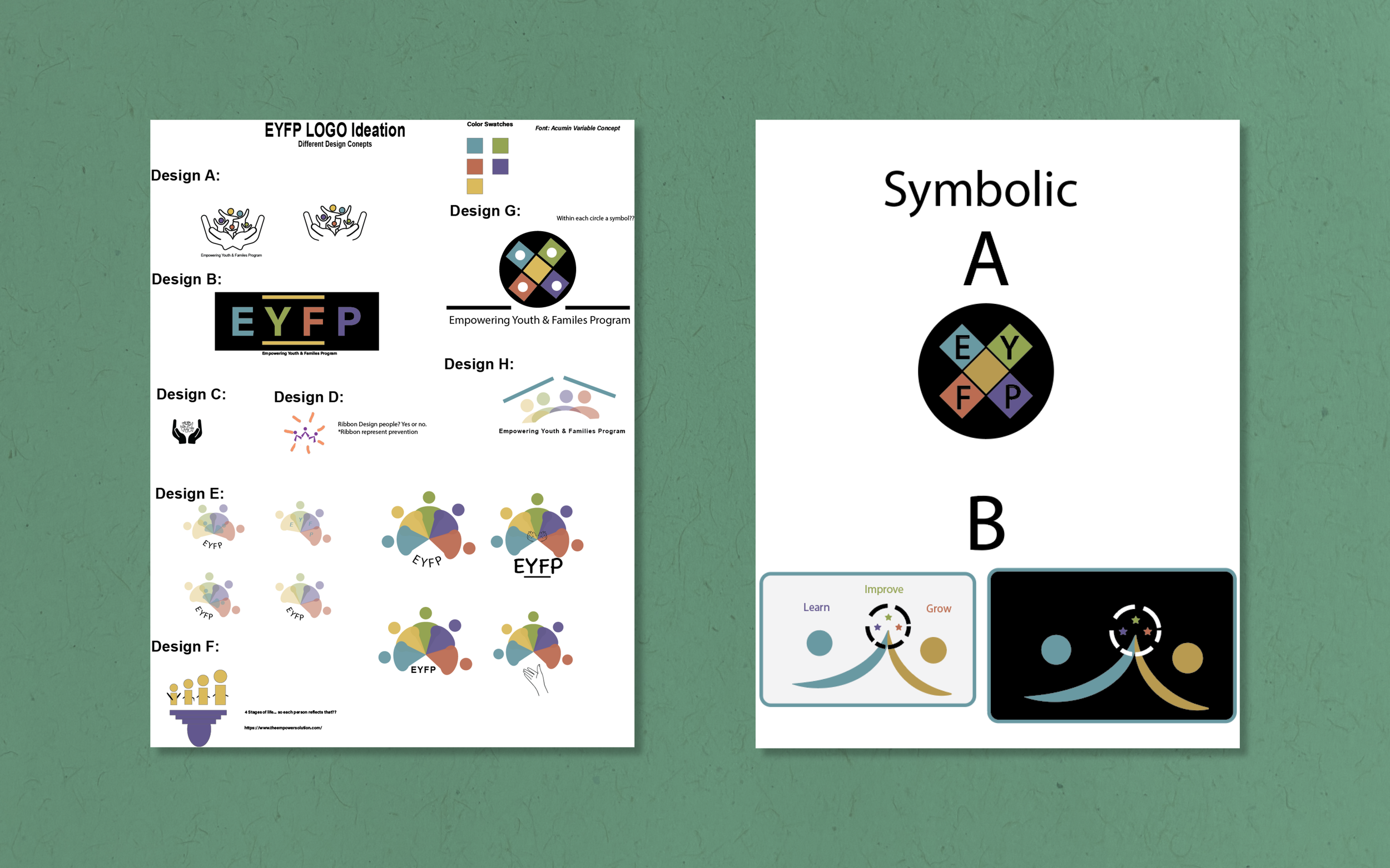
My coworker's presentations to the graphics team and I to make decisions.

Final draft iterations of the EYFP logo developed by my coworker and presented before the graphics team and I.

Final EYFP Logo.

My initial thumbnails for my part in the PFPC logo development.

My thumbnails developed into mockups.

My own ideas merged with my coworker's. The right list represent the final draft for the graphics team selection.

Final PFPC Logo.

Initial ideation of the branding guidelines document.

Theme mockups for branding guidelines.

Final set of guidelines (click to view).
Takeaways
Crafting a brand identity is like world building for your story. Something I’ve always been obsessed with since I was young. I love planning for the future and framing rules to be accessible to a wide range of audiences. Logo building on its own is always a delight, and it was a pleasure to work with our intern and help teach him more about Adobe Illustrator. I’m very glad I could fully flesh out this project for future reference within the company, and I look forward to working on similar projects in the future.